12 Best Data Journalism Examples:Storytelling with data
One of the most interesting areas to develop recently is data journalism – that is, using data to tell stories. Sometimes, this might be a large, data-driven website like some of the examples below. However, even ‘softer’ approaches like including graphs and infographics are an example of how successfully data can add life and credibility to journalistic pieces.
Below are 12 best examples of data journalism on the web which not only just present the data – they still manage to weave in a story and help the reader to understand the issue and interpret the information.
Table of Contents
- 0.1 1.The Guardian: Edward Snowden NSA Files Decoded
- 0.2 2.Gapminder: Wealth & Health of Nations
- 0.3 3. Mapping the 2010 U.S. Census
- 0.4 4.Immigration Explorer
- 0.5 5. An in-depth look at USA’s religious beliefs, practices
- 0.6 6. Wind Map
- 0.7 7. Scientific Visualization Studio – Hubble Maps Jupiter in 4k Ultra HD
- 0.8 8. Bloomberg Graphics – Millennials Can’t Crack Congress
- 0.9 9. San Francisco Chronicle 2016 Election
- 0.10 10. ProPublica – How Voter Fraud Works – And Mostly Doesn’t
- 0.11 11. Chartball – Pro Basketball Season Histories
- 0.12 12. Data Driven Journalism featured projects
- 1 Free Data Journalism course
- 2 Data Journalism Handbook
- 3 Conclusion
1.The Guardian: Edward Snowden NSA Files Decoded
One brilliant example of data journalism is from the newspaper (and online news source) the Guardian. Although Edward Snowden’s leak of NSA files was one of the most significant incidents of our time, the files were largely meaningless as thousands of pages of raw data. The sheer amount of information meant for most people, it was meaningless.
The Guardian, which has been a forerunner to data journalism for some time, was able to swiftly ‘decode’ the data, presenting it in a way that allowed readers to easily get an idea of what the information was, and what the implications were. The highly interactive site is a stellar example of what a well-resourced news outlet can do with the exciting new art of data journalism.
2.Gapminder: Wealth & Health of Nations
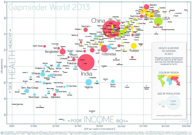
A different approach has been taken by the not for profit organization Gap Minder. Gap Minder is not a traditional news organization, but instead aims to publicise facts and statistics about the world. By using their innovative and entertaining website, audiences can easily track the progress of any country in the world against a range of indicators such as Gross Domestic Product (GDP), infant mortality, and more. Visitors can also place multiple countries on the graph at once, in order to measure the “gap” between them.
This site is an excellent example of the benefits of data journalism. Not only is the site highly entertaining with its interactive nature and simple controls, but it also presents an important message about the world to its readers. This innovative approach shows how data journalism can easily demonstrate very complicated concepts in a fun and easy way. Gap Minder also publish all their data, in full so that you can check the accuracy.
3. Mapping the 2010 U.S. Census
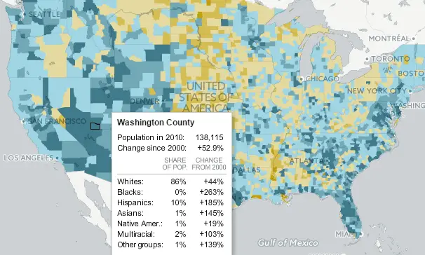
The goal of creating an interactive map based on the 2010 U.S. Census served as a way to survey different ethnic populations across the United States. For example, the census found a great increase in the Hispanic population and a decrease in Caucasian population in Virginia. Moreover, by inputting either a city or zip code users can view data specific to their geographic location.
Comparing the 2010 census with that of 1990 and 2000 shows an upward trend in increasing Hispanic populations, likely to due to increased immigration. Nonetheless, the survey also found that Caucasian populations remain the largest group in the United States, but have experienced a standstill in growth.
4.Immigration Explorer
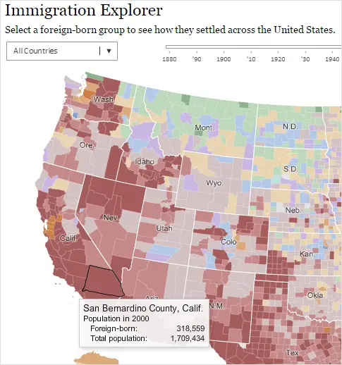
The New York Times came up with a concept for interactive mapping, referred to as the Immigration Explorer. The map provides thorough visuals to show how immigrant settlement has changed in each state over the years.
Immigration Explorer enables a user to toggle over a state and see an exact number of resident immigrant populations. Moreover, users have the option of zooming in on counties in order to see increases in specific populations over time. Immigrant populations are organized by colors assigned to each ethnic group, with the most substantial immigrant populations found near the Mexico border, south Florida, and the big cities.
5. An in-depth look at USA’s religious beliefs, practices
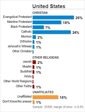
The religious interactive map seeks to chart and trace religious variations among groups in proportion to geographic regions in the United States. The study seeks to conduct an in-depth analysis of the religious beliefs of Americas. It was successfully concluded that 92 percent of Americans identified with a religion and presence of God. However, even though most people acknowledged the concept of prayer, they also demonstrated a tolerant attitude in regards to other religions.
There is a general believe that perhaps more than one religion can lead to a complete salvation. Moreover, it was concluded that even Americans who don’t directly believe in God do believe there is a higher power. Thus, according to the data, it can be assumed that America consists of people who do believe in the divinity of religion.
6. Wind Map
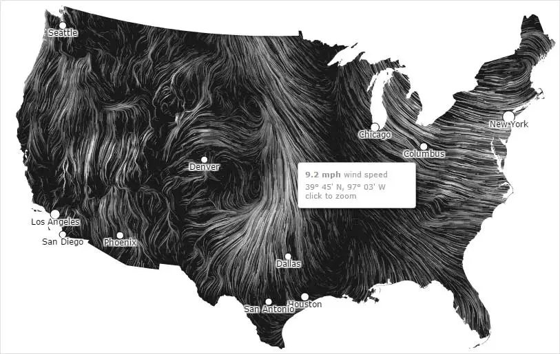
The interactive Wind Map seeks to provide a visual of the air flowing throughout the United States at any given time. The initial map was created during winter, which generally tends to have stronger winds than spring or summer. The map aims to map wind movement through moving currents visible on the screen. Depending on the weather patterns on a particular day, the wind visuals can appear to be soothing or violent.
Initially, the map was intended for educational purposes, but over time has transitioned into a map for recreational use. For example, the wind map has often been reported to be used by bird watchers for recording bird movement, by cyclists for route planning, and by scientists for observing wind patterns for energy purposes.
7. Scientific Visualization Studio – Hubble Maps Jupiter in 4k Ultra HD

The Hubble Space Telescope has provided scientists with new and breathtaking images of Jupiter in Ultra HD. The images obtained from the Hubble Space Telescope contributed to the Ultra HD footage of Jupiter. Further, the images from the Hubble Space Telescope show clouds, storms, and atmospheric pressures.
The gathered information is then used to establish the conditions on Jupiter and predict future planetary behaviors. Moreover, these recently obtained Ultra HD images verify that the Great Red Spot has been decreasing in size and taking on a more circular shape. All of these determinations have lead to a more thorough understanding of Jupiter.
8. Bloomberg Graphics – Millennials Can’t Crack Congress

As 2016 comes to a close, the amount of millennials living in the United States has exceeded the baby boomers. However, when it comes to voting millennials are still considered extremely scarce in Washington, rarely voting in elections. Further, when it comes to running for office, the data journalism examples depict that about one-third of millennials don’t meet the age requirement to run for a House seat.
As of now, only five millennials hold elected office in Congress. The reason for this disproportionate representation in Congress is due to a staggering 95 percent of members being re-elected, creating a larger demographic of older members and not enough millennials.
9. San Francisco Chronicle 2016 Election

According to the data journalism examples found on the interactive map, there is a depiction of how each candidate did in a given state, focusing on the California’s elections and results. While scrolling through the interactive maps, the user can clearly see which area was a Republican stronghold versus a Democratic one.
Furthermore, the interactions cover accepted or rejected propositions related to education, medical care and crime. The live election results coupled with the interactive maps make it easier for voters to track voter updates throughout the voting window. Further, for voters wanting to check on the results of state-specific issues can also do so with ease due to the easy to navigate features of the interactive map.
10. ProPublica – How Voter Fraud Works – And Mostly Doesn’t

Voter fraud in elections is always a hot topic during every election cycle. Voters of different denominations throughout the Unites States acknowledge the possibility of voter fraud. Usually, the talk of voter fraud is quickly talked down my officials responsible for elections. However, with the recent election in which Trump and Clinton were neck-to-neck voter fraud suspicions have again resurfaced.
Interestingly enough, in this election cycle the candidate himself, Donald Trump, raised the possibility the voter fraud if Hilary Clinton won. According to depicted data journalism examples, conversations regarding voter fraud have been around since the 1970s and 1980s. There have been many stories of people trying to vote twice, having someone vote in their place, and voting for their decrease spouse. Convictions were brought upon all these types of individuals, yet, voter fraud on a large scale has never officially been investigations by the nation’s justice system.
11. Chartball – Pro Basketball Season Histories
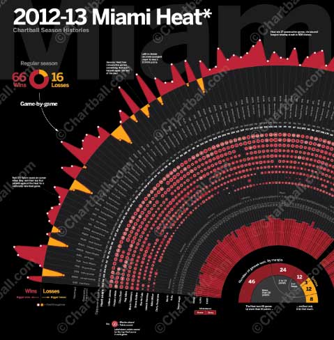
The examples presented here are interesting because they double as works of art. For example, some posters pertain to basketball histories of popular teams such as the Cleveland Cavaliers, Golden State Warriors, and Miami Heat. The posters list the most important highs and lows of the specific team and its players. Other data found on the posters lists a number of total points the team earned in particular games. Further, the scores of players are also reported in a unique style and design that varies from poster to poster. The charts are available for purchase for around $30 a piece, based on 24 by 36 framing dimensions.
12. Data Driven Journalism featured projects
The types of work highlighted on this website is a potpourri of journalism projects from diverse writers around the world. This website is often considered the best source for educating oneself or an audience on data journalism topics.
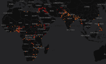
An interesting project currently present on the website it titled Fragile Cities: Plotting lesser known urban stories. Everyone around the world is aware of huge metropolitan cities such as Chicago, New York, London, however, what about lesser known cities? The article tracks lesser known cities and provides information on their populations including, growth, air quality, crimes rate, and politics, to name a few.
Free Data Journalism course
If this all sounds exciting to you, data journalism may be something that you wish to explore further. There are a number of fantastic resources available online, a number of which are completely free. Some of the free data journalism courses which are available include:
- A free online data journalism course with 5 leading experts.
- LEARNO:Online courses for media professionals
- Data Journalism free online training series provided by the highly respected Berkeley University
- Extracting data from Facebook Pages using Facebook API
- Web scraping using import.io using import.io:No programming skills required
Data Journalism Handbook
In addition to the above online resources, there is also a great book that provides a good overview and introduction to data journalism. ‘The Data Journalism Handbook’ is a fantastic publication which has been relied upon by some of the greatest news sources in the world, including the BBC, Guardian and New York Times. Best of all, this handy publication is published in cooperation with the Open Knowledge Network and is available totally free online.
Data visualisation books
Data journalism involves a great deal of data visualisation. I have reviewed top 10 data visualisation books.
Conclusion
These are great resources to begin in the world of data journalism. However, the nature of this approach is that it is only limited by what journalists do with it – so don’t be afraid to take risks and try new things.


